Creating a compelling one-page website requires careful consideration of design elements that not only attract visitors but also effectively communicate your brand message. Two foundational aspects that can make or break your site’s effectiveness are typography and colour choices. The team at Emprede Web understands that these elements are not merely decorative—they fundamentally shape user experience and conversion rates on single-page designs where every pixel counts.
Typography selection for maximum impact
Typography sets the tone for your entire website before visitors even begin reading your content. The right font choices can establish credibility, evoke specific emotions, and guide users through your content with visual hierarchy that keeps them engaged from top to bottom of your single page.
Readability and brand consistency
When selecting typography for a one-page site, readability must take precedence over trendy designs. Sans-serif fonts like Montserrat, Roboto, and Exo provide excellent readability at smaller sizes (under 16pt), making them ideal for body text sections where visitors need to digest information quickly. For more traditional brands, serif typefaces can add sophistication to longer text sections while maintaining legibility.
Your font choices should align with your brand identity across all touchpoints. If your brand uses particular typefaces in other materials, incorporating these into your website creates consistency that strengthens recognition. Consider the personality of fonts—whether they convey authority, playfulness, innovation, or tradition—and ensure this aligns with your brand values.
Font pairing strategies for one-page designs
Since one-page websites must communicate efficiently, strategic font pairing becomes crucial. The general rule is to limit your selection to 2-3 complementary fonts to maintain visual coherence. A common approach is using a distinctive display font for headings and a more conservative, highly readable font for body text.
Creating contrast between heading and body fonts helps establish clear visual hierarchy. You might pair a bold sans-serif heading font with a serif body font, or vary weights within the same font family. Tools like Google Fonts offer excellent free options with extensive language support and OpenType features. Fonts like Alegreya and Spectral provide versatility with multiple weights and styles, making them ideal for one-page sites where you need variety without switching typefaces.
Strategic colour palettes that convert
Colour choices significantly influence visitor perception and behavior on your one-page site. A thoughtfully curated colour palette can guide attention, evoke specific emotions, and ultimately drive conversions.
Limiting your colour scheme for visual coherence
For one-page websites, colour restraint is particularly important. Following the 60-30-10 rule provides an excellent framework: dedicate 60% to your primary colour, 30% to a secondary colour, and 10% to an accent colour that draws attention to calls-to-action. This approach creates harmony while ensuring important elements stand out.
Start by selecting a primary colour that represents your core brand identity. Then add 3-5 complementary colours that work together to create a cohesive experience. Tools like Adobe Color and Coolors.co can help generate harmonious palettes based on colour theory principles. Remember to consider both light and dark mode versions of your colour scheme to accommodate user preferences and viewing conditions.
Contrast considerations for text legibility
Text legibility depends significantly on the contrast between text and background colours. For accessibility compliance, aim for a contrast ratio of at least 4.5:1 for standard text. This ensures that users with visual impairments can easily read your content and helps all users navigate your site more effectively.
Avoid placing text over busy backgrounds or using colour combinations that create visual vibration. Instead, use contrasting colours strategically to highlight important information and create clear boundaries between different sections of your one-page design. Never rely solely on colour to communicate critical information, as this excludes users with colour vision deficiencies.
Emotional responses to colour choices
Colours evoke powerful emotional responses that can significantly impact how visitors perceive your brand and interact with your website. Understanding these psychological connections allows you to strategically select colours that support your business objectives.

Psychological impact of different colour schemes
Each colour carries its own psychological associations that can be leveraged in your design. Red creates a sense of urgency that can boost conversion rates for limited-time offers. Blue builds trust and security, making it appropriate for financial services or healthcare providers. Green connects with themes of growth, sustainability, and wealth, while yellow brings warmth, optimism, and energy to your design.
However, these associations vary across cultures. What communicates success in one region might signify something entirely different elsewhere. Research your target audience’s cultural background to ensure your colour choices convey the intended message. For international audiences, consider more universally positive colours or adapt your palette for different regions.
Colour harmony principles for web design
Colour harmony creates visual interest while maintaining balance and coherence. For one-page websites, where all content appears on a single canvas, colour harmony becomes even more critical for guiding the user journey. Monochromatic schemes using different shades of a single colour create subtle sophistication. Complementary colours (opposite on the colour wheel) create vibrant contrast for highlighting calls-to-action. Analogous colours (adjacent on the colour wheel) create smooth transitions between sections.
Successful brands demonstrate thoughtful colour application. Airbnb uses a minimalist colour palette with their distinctive coral accent colour to create recognition across platforms. YouTube combines a bold red with clean white space and simple sans-serif typography that allows content to take center stage. These examples show how strategic colour choices support brand identity while enhancing usability.
Cross-Device Testing for Typography and Colours
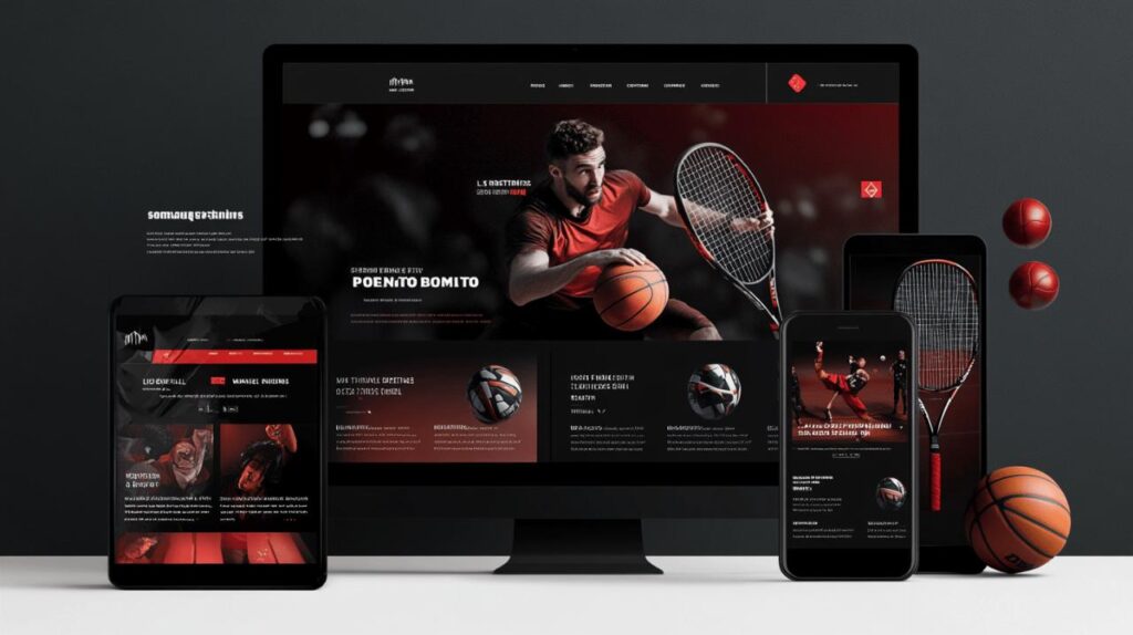
With visitors accessing websites from various devices with different screen sizes and resolutions, ensuring your typography and colour choices work across all platforms is essential for a consistent user experience.
Responsive typography considerations
Typography must adapt fluidly across devices while maintaining readability and hierarchy. Set your base font size to at least 16px for body text to ensure legibility on mobile devices. Implement responsive type scales that adjust heading and text sizes proportionally based on screen dimensions.
Consider line length carefully—too long makes text difficult to track, while too short creates choppy reading. Aim for 45-75 characters per line on all devices. Test how your font choices render on different operating systems and browsers, as some fonts may appear differently or load more slowly on certain platforms. Fallback font stacks ensure your design degrades gracefully if primary fonts fail to load.
Ensuring colour consistency across all screens
Colour appearance varies significantly across devices due to differences in screen technology, calibration, and environmental lighting conditions. Test your colour palette on multiple devices to identify any problematic combinations that lose contrast or appear differently than intended.
Use standardized colour values (HEX, RGB, or HSL) consistently throughout your CSS to maintain colour harmony. Consider how your colours appear in different lighting conditions, particularly for mobile users who may view your site outdoors. Avoid colours that are at the extreme ends of the saturation spectrum, as they may cause display issues on certain screens. Through careful testing and refinement, you can ensure your typography and colour choices create a cohesive, accessible experience that supports your brand and business goals across all devices.

